
#21 9 Ways To Improve The Accessibility Of Your Business
For the past couple of weeks I've been working on an accessibility audit for an app that helps seniors regain their balance. It's been a while since I've done one of these– the last time was a few years ago when I completed a 13 platform audit for STARZ.
This project has been such a good reminder of the accessible design fundamentals that if all creators and founders knew, their businesses would be more inclusive and welcome more people.
Accessible design allows people that experience disabilities to utilize the world around us in the same manner that abled bodies can. But accessible design also improves experiences for ALL humans.
Fundamentally, the reason I believe in community-driven products is because I believe that businesses that prioritize community will make the world better.
If you're here because you want to build a community-driven org then I'm willing to bet you care about building an accessible business too.
My goal for today is that you leave with a few super actionable tips to make your business more accessible. Ready? Let's dive in–
You might be familiar with ADA compliance in the built environment– things like handicap showers, handicap parking, ramps at public buildings in addition to stairs, elevators, etc.
There are a lot of rules – like how wide a door opening must be and how much square footage is needed in a public restroom entrance & handicap stall.
These kinds of rules exist in the digital world too– it’s called the WCAG (web content accessibility guidelines) and compliance is required by the US government via Section 508.
The guidelines aren’t easy to digest… you can view the requirements here if you’re curious.
I know this all may sound overwhelming when you already have an endless to do list but I’m going to share some digestible tips, based on these guidelines, that you can implement in your business right away to build more accessible products and content.
Accessible design goes way beyond "compliance" –ick and into creating experiences that welcome all bodies + people. It comes back to service like all community-driven work.
When you’re serving a community, you want to make sure that everyone feels comfortable participating and can take advantage of everything you’re offering.
01 Include captions on your videos
When you include captions on your videos – I’m talking YouTube, within your product or even on your Instagram stories– you are including people who are hard of hearing or can better comprehend content when it includes a mix of audio, visual & written context.
You’re also including people that can’t have their sound on in that moment but want to hear what you have to say. This is a WIN-WIN in your business.
More accessibility = more people consuming your work.
02 Use alt text for your images whenever it’s offered
Alt text is what a screen reader will read to someone with visual impairment to describe the image or media on the screen that they can’t see well.
Most platforms allow alt text and will even reward you in the algorithm for utilizing them.
Wherever you’re adding photos in your business whether that is within your app, your community forum platform, social platforms or your own website, add alt text as often as possible.
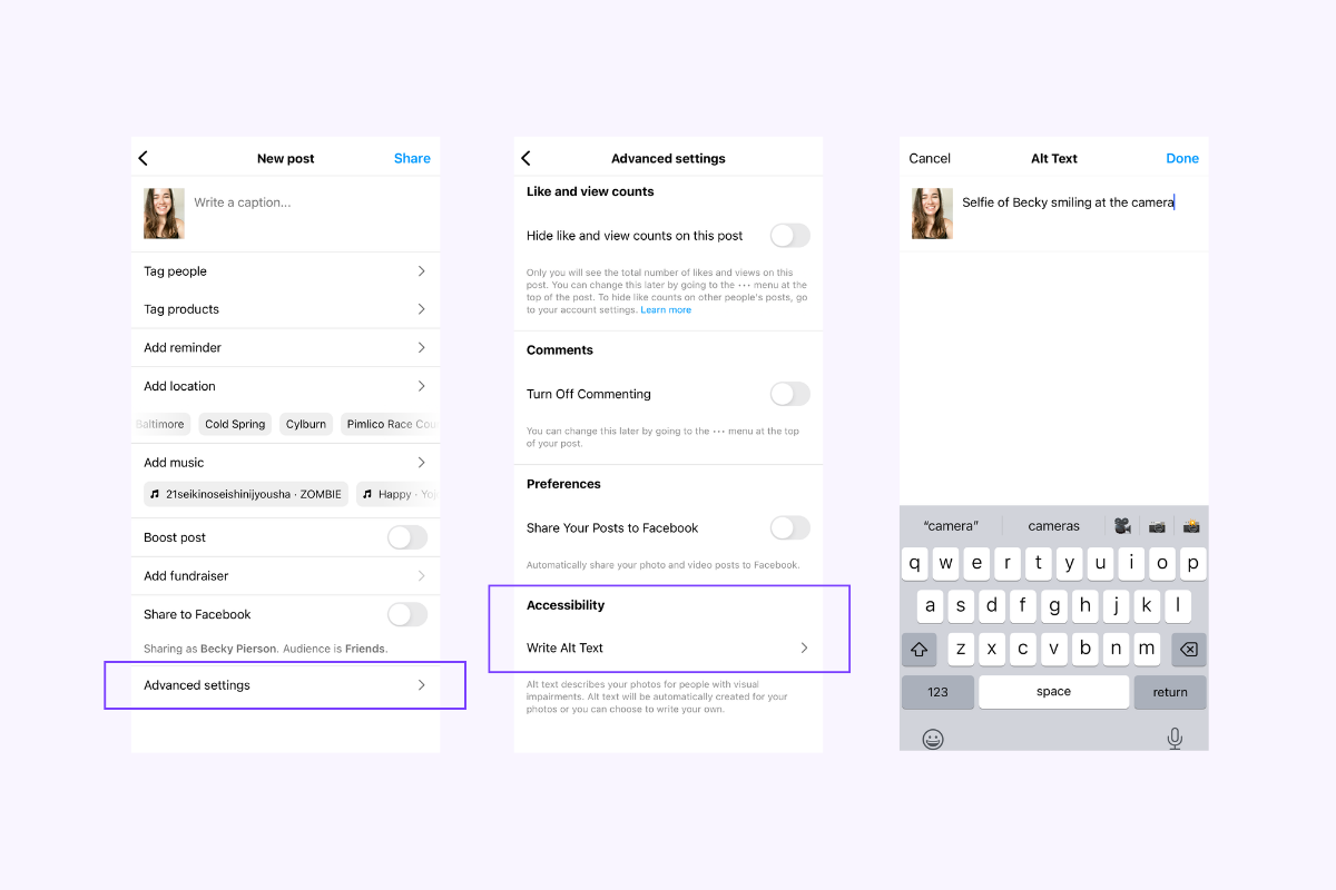
Instagram has their alt text a bit hidden– but this is how you do it!
03 Use a legible font size (it’s bigger than you think)
I’m looking at you (and me) tiny instagram story writers.
If you have perfect vision, really small text might look more aesthetically pleasing, but it’s not about you. It’s about everyone else trying to read your content.
Technically your text should be at least 16px to pass accessibility rules. Keep in mind px (pixels) sizes are for digital products and px doesn’t equal pt sizes like 12 point font for a print document.
You can check that your body copy is 16px on your website, and be mindful of making your copy too small in your content images and your social content.
04 Avoid using images of text wherever possible
When you use images of text, screen readers can’t process the words. According to the WCAG, a logo is the only time you should use an image of text. Now, with that said…
Images of text are all the rage in social content lately. So if you’re doing this, make sure you’re either linking to a written version (ie. twitter thread or document) or you’re including all the copy that is on the image in your alt text.
05 Use enough color contrast
To be compliant the WCAG suggest a 4:5:1 ratio… this is especially crucial for important information and your buttons. To check your contrast use this tool from the W3C. Just pop the hex code of your button background and text color (foreground).
This will also improve your conversion rates– people are more likely to click your button if they can see it easily.
A big mistake I often see is with body copy or paragraph content. People love to use gray text on a light gray background. It’s not accessible. Run those hex codes through the contrast checker and adjust until it’s giving you a ‘PASS’ for level AA.
You put so much energy into writing your copy, make sure people can see it.
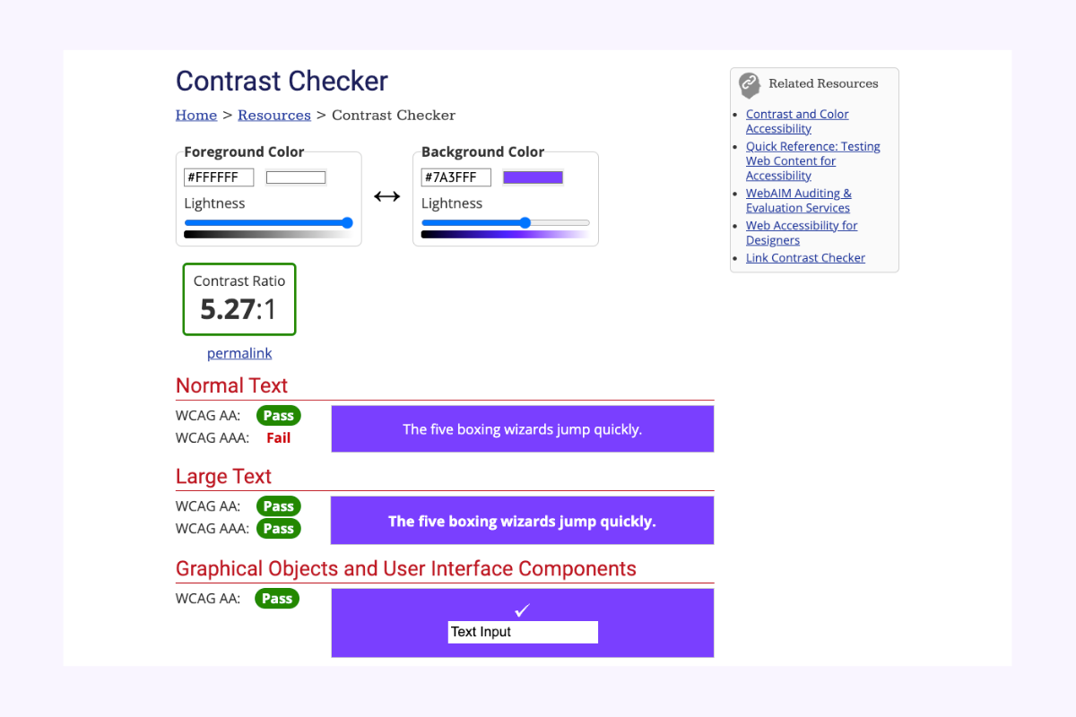
W3C contrast checker for my primary brand color
06 Keep a consistent navigation pattern
One of the most frustrating user experiences is getting lost within a product– when a user has lost their “sense of place” they are likely to exit the product or website entirely.
Avoid this by using consistent navigation patterns, back buttons and breadcrumbs for deep layered content.
A consistent navigation pattern means you don’t change your global navigation or remove it when someone has clicked around your website. They should always know how to get back or home.
07 Clear copy > clever copy
Make sure the button text and page headings you use are clear.
People are more likely to click a button if they understand what’s going to happen next. “Let’s Do This” is not as clear as “Continue To Checkout”.
When someone uses a screen reader it will read them the heading of the page first (if its built correctly) and so you want that to be descriptive enough that a user will understand if they want to keep reading on that page.
08 Use labels
Make sure you use clear labels over your form fields.
When a user starts typing, they may forget what the field was for. By having a label above the form field, they can be reminded what they were doing.
You can also use “hint text” within the form field itself to give a user an idea of what kinds of things they can respond with.
In addition, make sure you provide error handling and suggestions. Think: login user flows. Isn’t it better when you know why a login isn’t working? Is it the username or the password? Luckily this is native to most platforms. But important to keep in mind if you’re building custom!

09 Make sure your website is navigable using a keyboard
You should be able to tab around the screen and press enter to select items using a keyboard on your website. This is equally important for mobile – many accessibility devices use external keyboards.
When you’re choosing a platform to build your website on, this is something you want to test. For example, Squarespace has great accessibility features.
When you navigate my website using a keyboard you can use the ‘tab’ and ‘enter’ functions to navigate the entire site. As you move around, a box is captured around each button that tells you what is in ‘focus’ to be clicked on. This is called “Focus Order” and required by the WCAG.

Notice that ‘Power Hour Workshops’ is selected by my keyboard navigation here in this screenshot
If you enjoyed today’s essay and you’d like to receive the weekly newsletter, you can subscribe here. If you’d like help with making your business more accessible, send me a note here or reply to my latest newsletter in your inbox!